Sometimes it is pretty obvious when Puppet changes something in your infrastructure and bad things happen in a big dramatic way. Other times it’s not so obvious. It can be invaluable to be able to correlate changes made by Puppet to other events happening in your infrastructure.
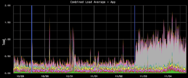
For example, in this diagram we have plotted the load average from a group of servers. Blue vertical lines mark points in time when puppet modified a resource on a host in the group. We can see that immediately following a puppet change the load spiked on one of the servers.
Code available on github:

